
Colour – some of us live for it, some of us are blissfully happy in a world of neutral beiges, but there’s no denying that colour affects our mood and emotions. Colour is all around us, whether outside amongst nature or inside the walls of your home, so it’s no surprise there’s been a great deal of thought and research around colour psychology and how it relates to marketing.
So, what is colour psychology, and how does it impact behaviours? Colour psychology is the study of how colours affect our behaviour and perception. In marketing specifically, colour psychology is primarily focused on how colour impacts our first impressions of a brand and whether the consumer will favour a particular brand above all other options out there. Up to 80% of quick judgements made about products or a brand are based upon colour alone. It’s something we all do, creative minded or not – I’ve certainly dismissed a restaurant because of its uninspiring interior or branding colour choices, it’s colour that instantly grabs you.
The effect that colour has on branding is significantly important, as it not only shapes how marketeers brand products but how consumers resonate with them. The partnership between branding and colour is a strong one, one that shapes brand identity, awareness, and trust. The colours used in a logo and any kind of branding are used purposely; so, the consumer associates a specific selection of colours with certain emotions that brands can then leverage.
The colour palettes are a key part of any brand identity project, so here’s a little insight into our thought process involving the use of colour on two exciting recent rebrand projects.
The Belfry Hotel & Resort – Navy, Teal, Gold
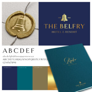
The client was keen to convey the importance of history and legacy, so navy was chosen to exude a sense of gravitas, trustworthiness, and authority.
There’s a real sense of sophistication at The Belfry so this is communicated with the gold. Paramount to any visit to the resort is a tangible feeling of vibrancy and energy and this is expressed by the contemporary teal colour.
Mar Hall Hotel & Resort – Green, Fawn, Ivory
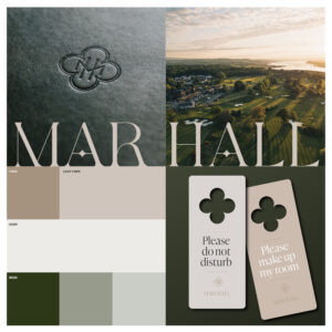
The palette for this one was inspired by nature and the surrounding Scottish landscape. We felt a natural palette was vital in underpinning the perception of Mar Hall as a soulful escape.
Green signifies renewal in the natural world but also a sense of heritage, luxury, and timeless elegance. There’s a feeling of huge depth to it which we felt was essential to get across given the history of the estate. Fawn has warm, calming qualities which perfectly reflect the peace and tranquillity to be found at Mar Hall. The ivory then works as an organic neutral to compliment both the green and fawn.
So, what colours evoke what feelings? It isn’t purely accidental that a brand like Barclays chose blue for their identity, so let’s delve a little deeper. Blue conveys stability, trust, and purpose – just look at Nivea, Oral B, HP and Dell. Red often signifies excitement, youth, passion, and power, which is why brands like Coca Cola, Virgin, and Nintendo use it so effectively. Yellow represents optimism, warmth, joy, and enthusiasm, seen in IKEA and National Geographic. Green shouts vigour, nature, growth, and durability, used by brands such as Land Rover, Starbucks and Lacoste.
If you really want to showcase premium, opt for rich dark shades of those colours. Black and gold are also often used in high-end brands to create that feeling of effortless sophistication, think luxury fashion houses such as Chanel, Louis Vuitton, and Versace. If you’re wondering what colour is most popular amongst businesses? It’s blue, and in any shade, which is seen in 33% of the top 100 global brands.
Now you’re maybe thinking, for someone so into colour and branding, what are my personal favourites out there? I’ve always been a fan of orange, and no brand makes better use of this vibrant colour than Hermès. I really love the story of how this use of orange came about. It was born out of a practical wartime necessity during World War II. When packaging materials became scarce, Hermès was forced to use a roll of orange paper that no one wanted, which ultimately then became a distinctive and recognisable element of the brand. Artistic director Pierre-Alexis Dumas once described it as pure “serendipity.”
Originally, the version of this logo was ivory with a gold trim, but it turns out that orange was a good choice, as it radiates energy, creativity, and warmth, bridging the gap between excitement and approachability, all key qualities that align with what the luxury brand represents.
So next time you find yourself thinking about your branding or find yourself at home clutching a paint brush and a colour chart, take a moment to decide what it is you want to convey, how you want to feel and how you would like others to view you, as colour is an extremely powerful tool, one that really does make all the difference.


